The three-minute picture version
Look at these first and you will know how 2.5 works. Expand further down when you want the prompt for each step.
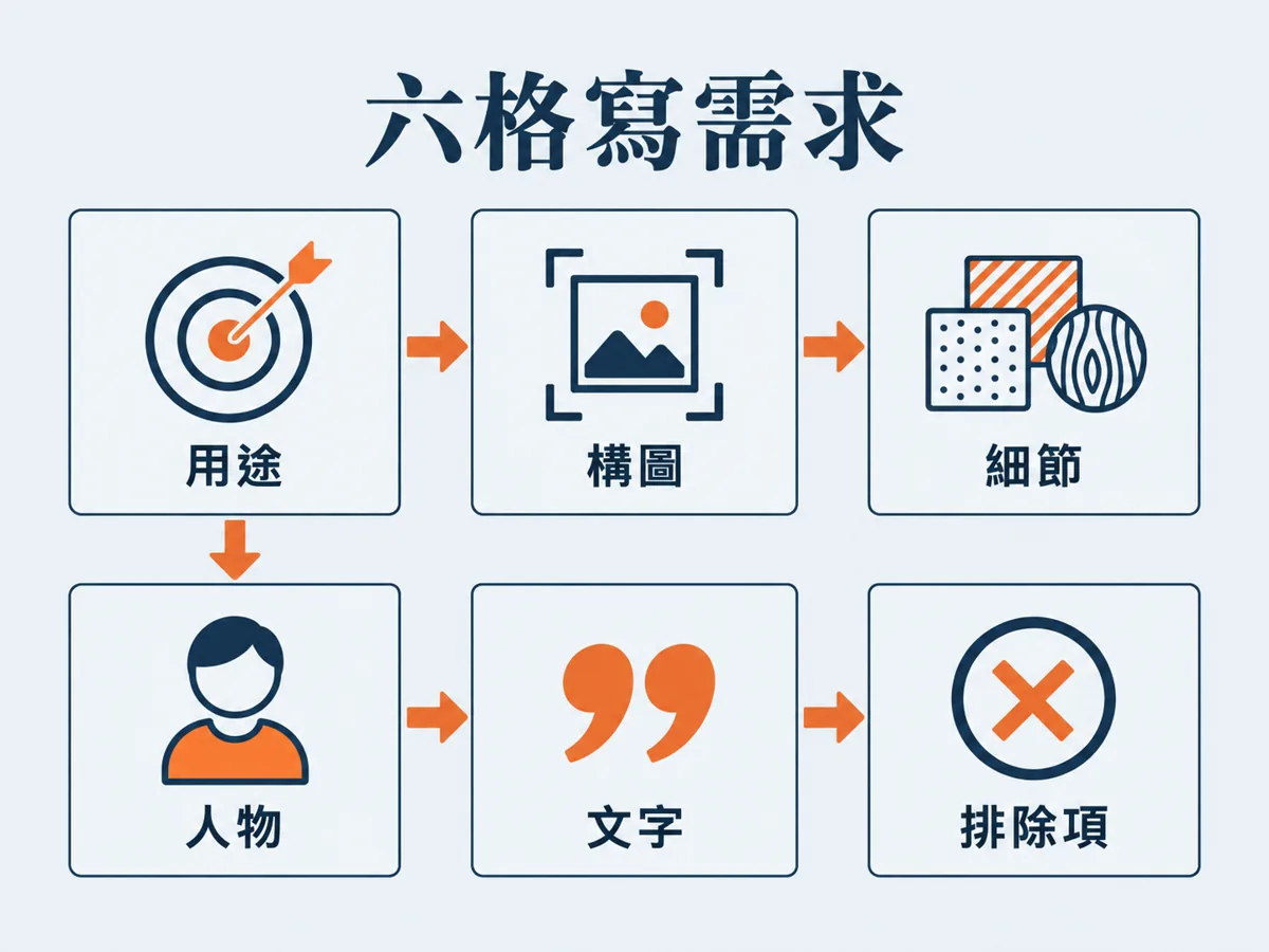 Six-slot order
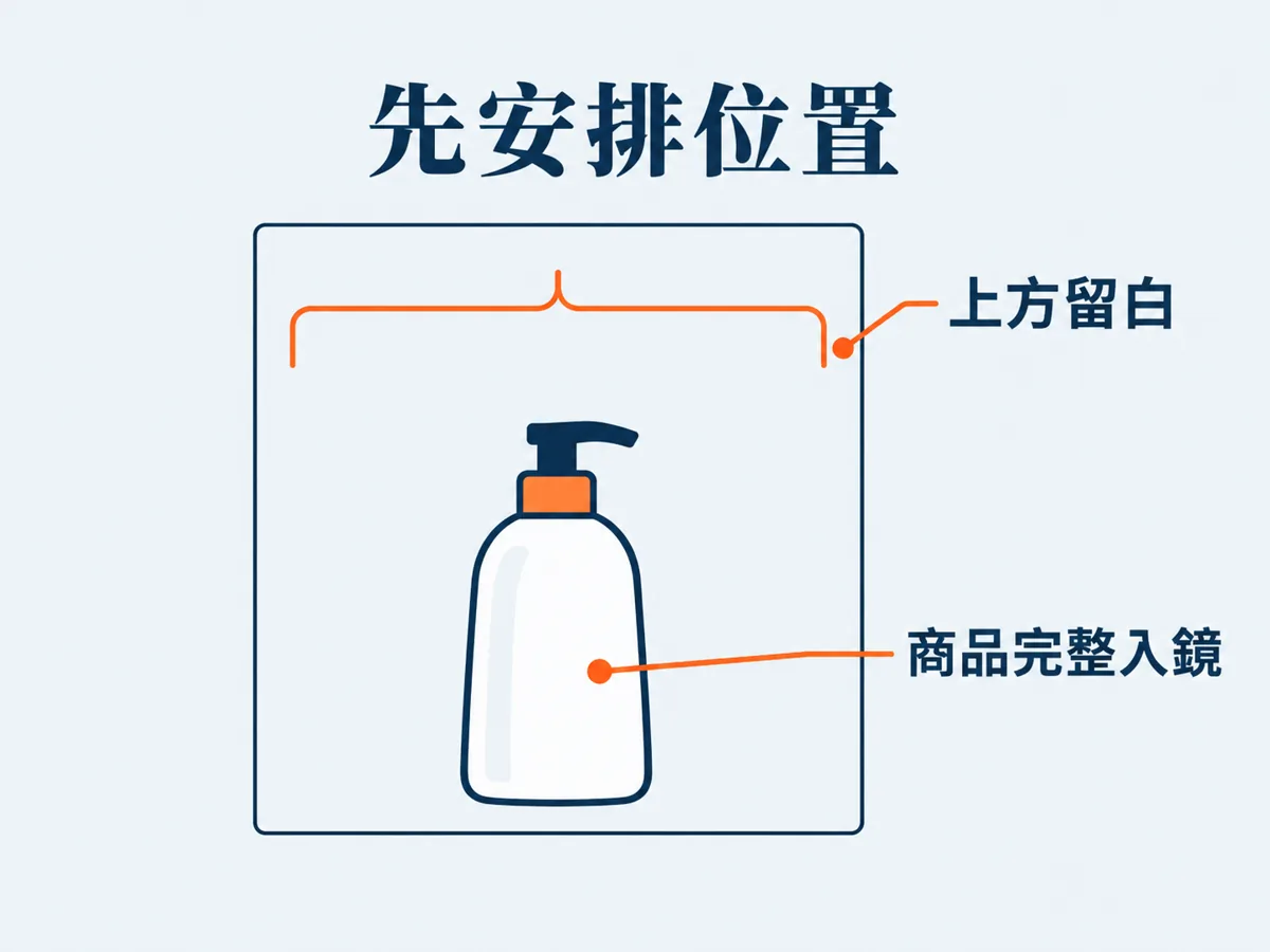 Place things first
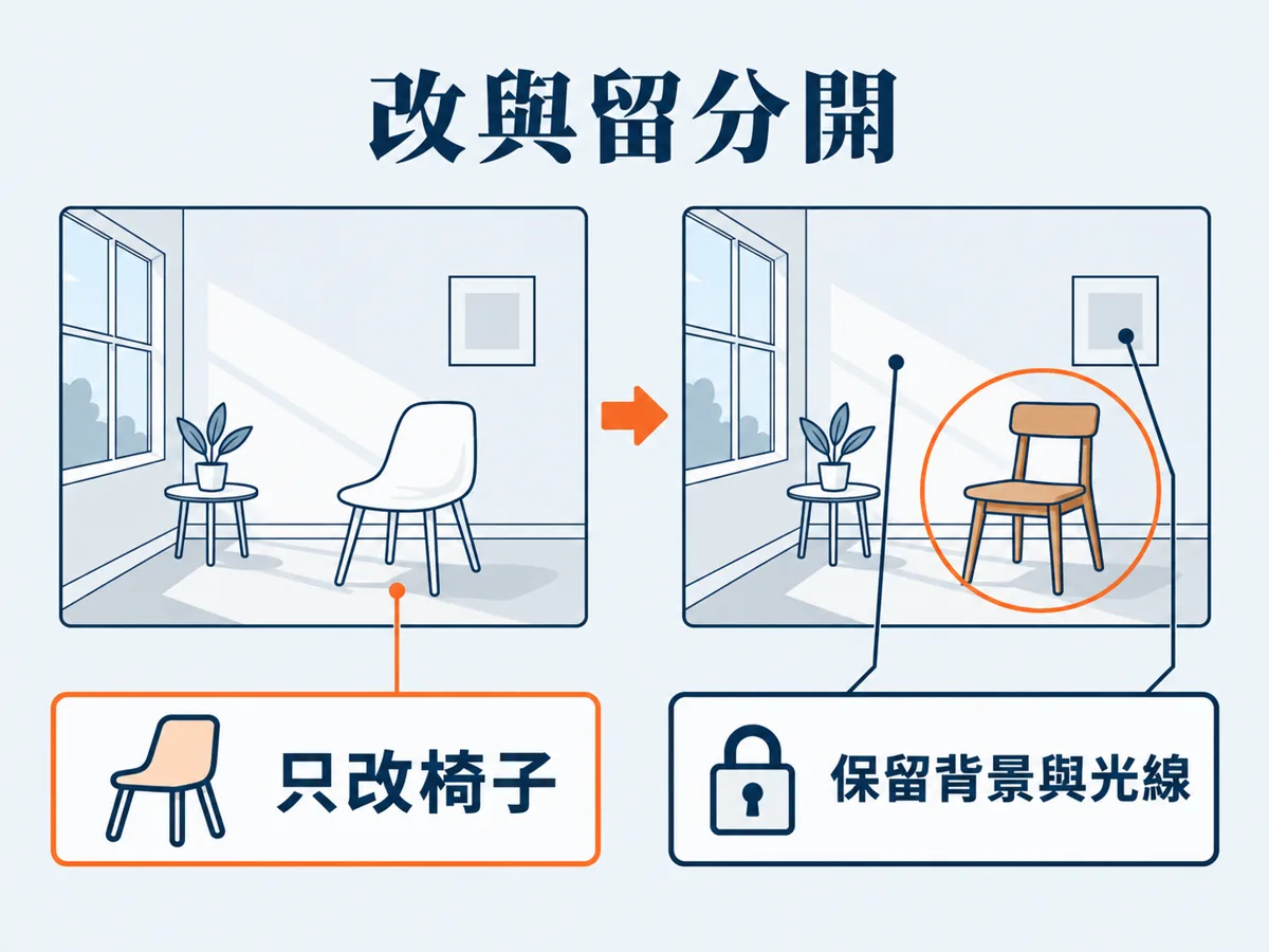 Change and keep, separated
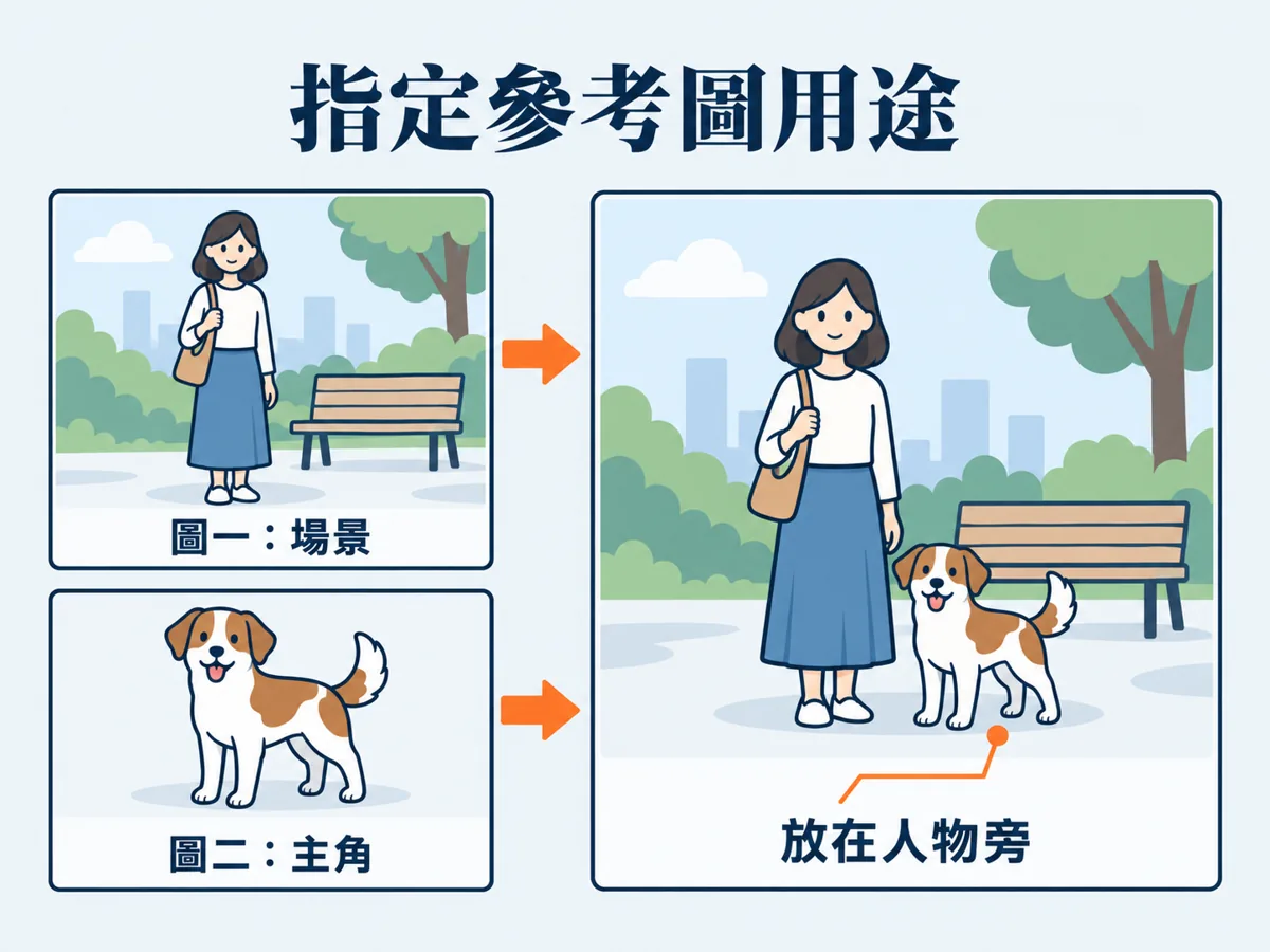 Give every reference image a role
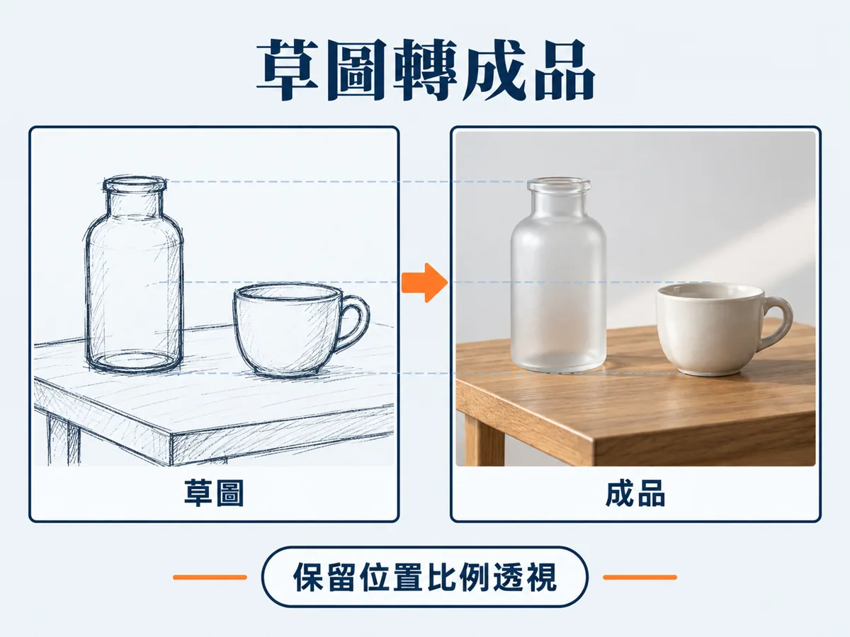 Sketch to finished image
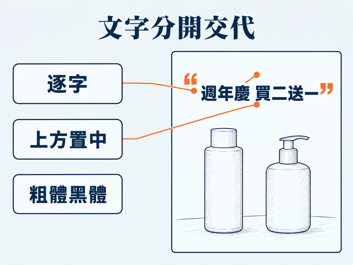 Text gets its own lines
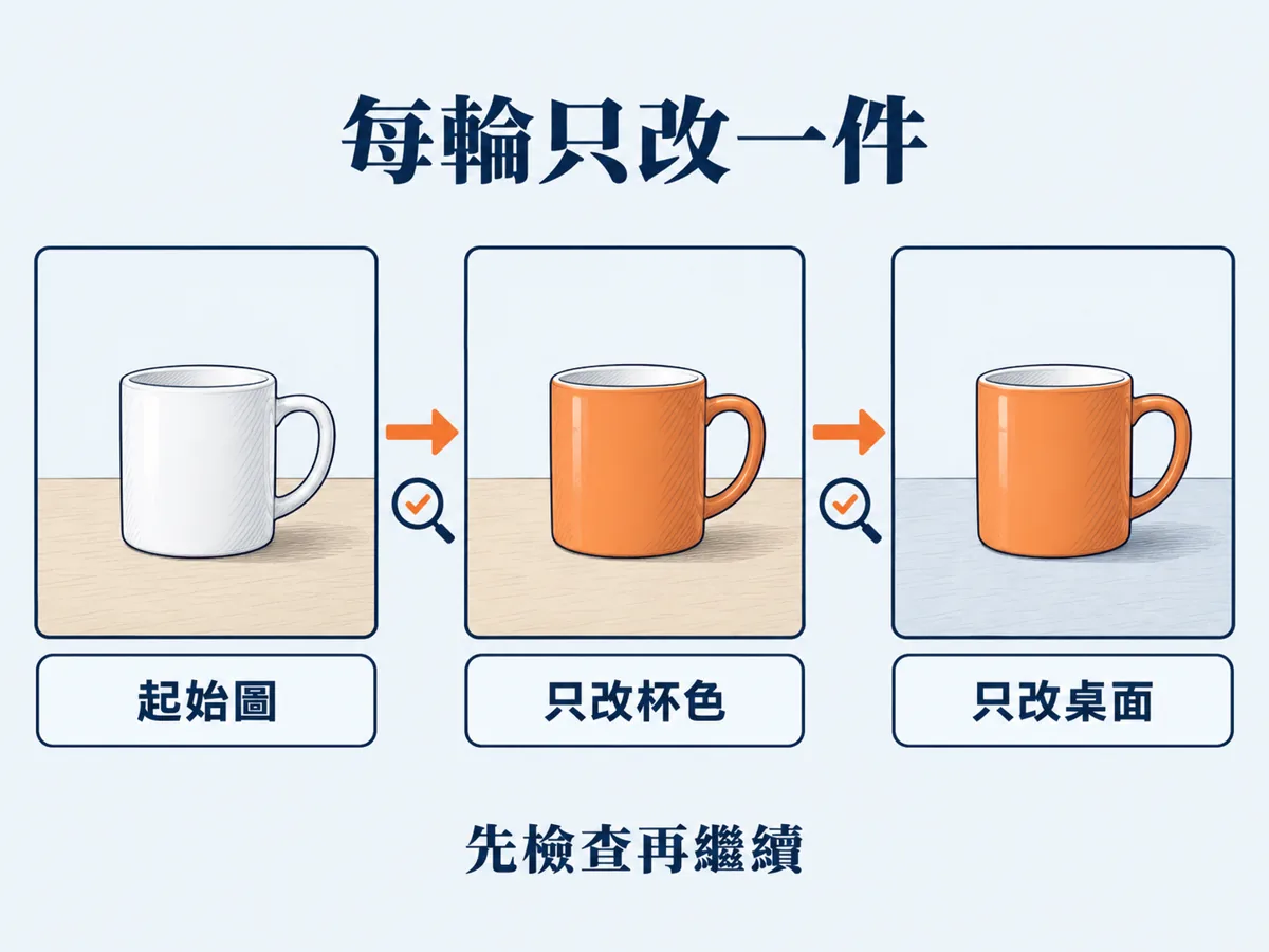 One change per round
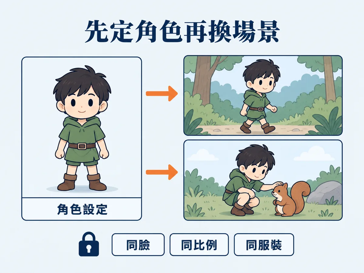 Lock the character sheet first, then swap scenes, same face, same proportions, same outfit
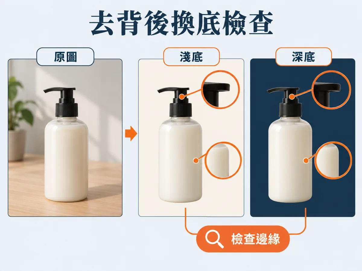 After cutting out, check the edges on a light and a dark background
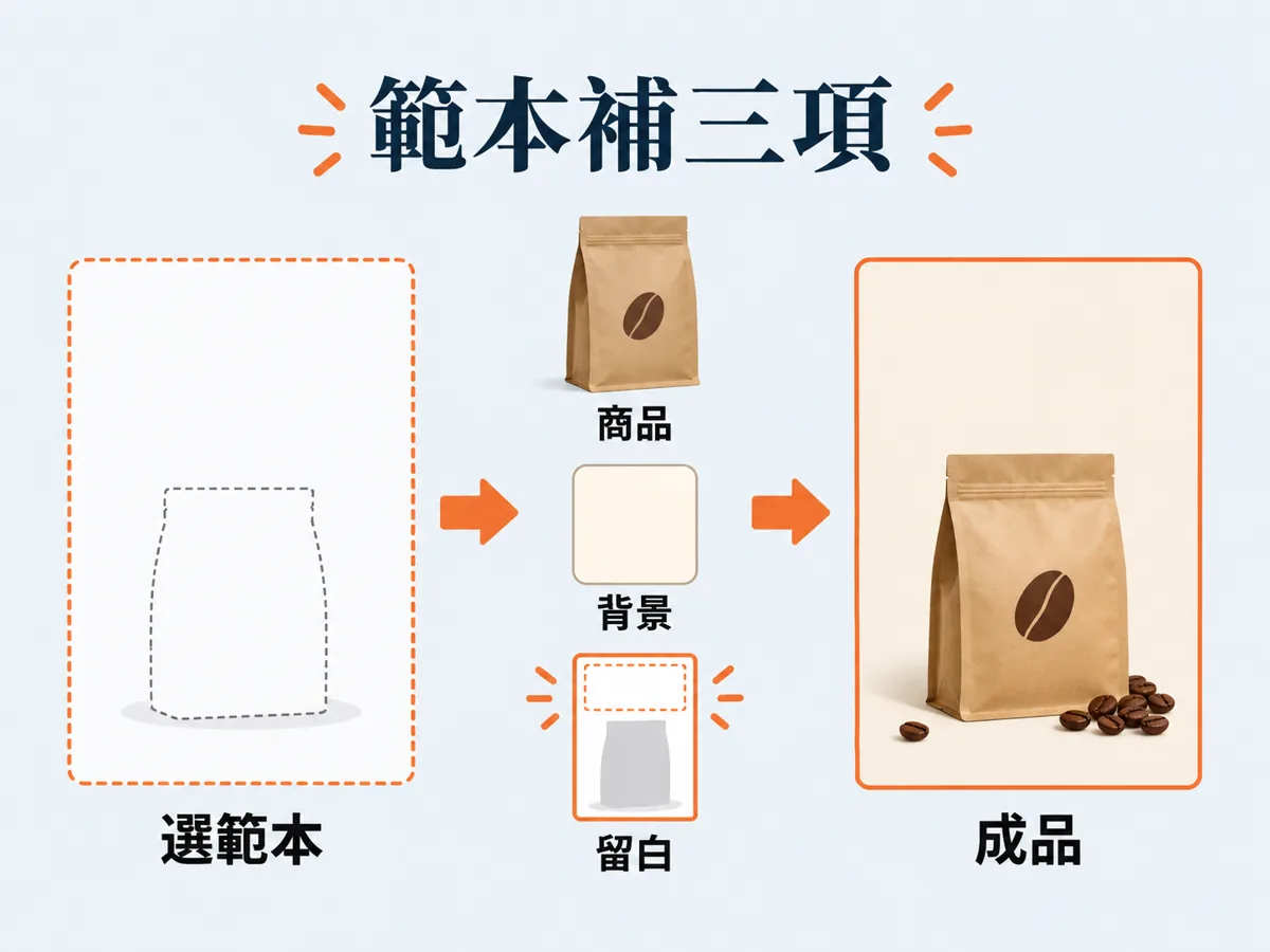 Start from a template
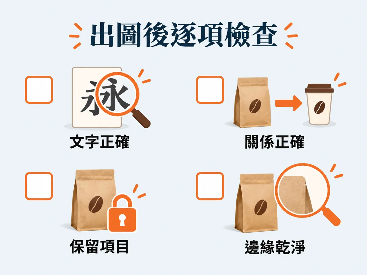 Check the result item by item
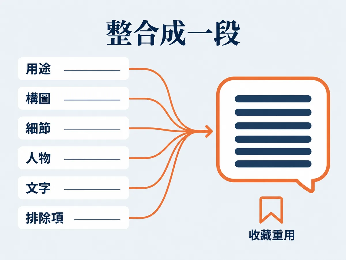 Join it into one paragraph
What changed in 2.5
OpenAI shipped ChatGPT Images 2.5 on 2026-09-08 and put an Image prompting guide in the developer docs the same day. The launch post covers the product features, the guide covers how to write prompts. This page merges both into a plain-language version you can follow with no coding background, with a copy-and-paste prompt attached to every section.
Six product changes matter to ordinary users.
- Sketch canvas: draw a rough sketch inside ChatGPT and use it as a reference.
- Templates: the examples OpenAI names are Poster and Merch, plus common formats like flyers and product photos. Pick a template, then add the message and the style you want.
- Annotations on the image: mark notes straight onto the picture to make a local edit.
- Faster: OpenAI says generation latency drops by up to 50% compared with Images 2.0.
- Stable across turns: editing repeatedly inside a long conversation drifts less, and earlier edits are easier to keep.
- Prompt sharing: when you share an image you can share the prompt with it, so someone else can swap in their own photo and details and run their own version.
The model itself differs in three places.
- Lighting and materials look more natural.
- The main subject in a reference photo keeps its likeness more reliably.
- It changes only the spot you point at, leaving the detail next to it alone.
OpenAI also says it handles complex layouts better, transparent backgrounds included. Images 2.5 is live in ChatGPT, ChatGPT Work and Codex on every plan, on desktop, mobile and web.
Sources: the official OpenAI Image prompting guide (checked 2026-09-10, developers.openai.com/api/docs/guides/image-prompting) and the OpenAI launch post Introducing ChatGPT Images 2.5 (2026-09-08, openai.com/index/introducing-chatgpt-images-2-5). Every fact on this page comes from those two.
Last updated: 2026-09-10
Part one: the six-slot prompt order
The official guide's Prompting fundamentals section lists eight principles (define the result, choose a format that is easy to maintain, describe visible details, say what people are doing, give text verbatim, separate changes from constraints, assign a role to each reference, change one thing at a time). The "six slots" below are my rearrangement of the first few into an order that is easy to fill in with no coding background. It is not an official format.
Expand for the full walkthrough and pasteable prompts
Slot one: purpose
Say what the image is and what it is for. The guide asks you to define the result first, naming the subject and the use, for example a product photo, an ad, a diagram. When the content gets complex, break the prompt into sections, scene, subject, detail and constraints, with a heading on each.
Slot two: composition and constraints
Next, say how the frame is arranged: composition, aspect ratio, and what has to sit where. This is the slot I drop most often, and the result is the subject cropped away, empty space in the wrong place, and text squeezed against the edge.
Slot three: visible details
The guide calls this one Describe visible details: state the material, the lighting, the colour and the visual medium. For a real photo, say "photorealistic" or "real photograph" outright and describe the framing and the texture. Camera specs (a 50mm lens, say) are only a hint about the look, not a promise that the lens is physically simulated. For wide-angle, cinematic, low-light, rain or neon scenes, the guide suggests writing out scale, atmosphere and colour, because mood adjectives alone are not enough.
Slot four: people and action
If there are people in the frame, say how much of the body is in shot, how big the person is next to the object, where the eyes are looking, and how the hands touch things. The guide's own examples are sentences like "full body in frame, including feet", "looking down at an open book", "both hands resting naturally on the handle".
Slot five: text in quotes, verbatim
For words that appear in the image, the guide asks you to put them in quotes verbatim and describe placement and font separately. For brand names or unusual words, spell them out letter by letter when needed. End with a line saying no other text, then check the spelling and legibility yourself. For small type, dense information, or several fonts at once, the guide suggests running quality at medium and at high and comparing the two.
Official example (the Render exact text section):
Slot six: exclusions
The last slot is what you do not want. The guide uses the same pattern across its examples: list the unwanted elements as a row of short phrases at the end. Common exclusions are watermarks, logos, extra text, checkerboard backgrounds, shadows, over-retouching, a stock-photo feel, gradients and ornament.
Part two: when editing, write what changes and what stays separately
This is the most valuable line in the whole guide for me. It is called Separate changes from constraints. When you edit, say "change only X" first, then list the details that must survive: the person's face, the geometry of an object, the layout, the lighting, the words on a label. Name the exclusions (extra text, logos, watermarks) in the same breath. For fine local retouching, also name the things that must not move, saturation, contrast, arrows, camera angle, surrounding objects.
Expand for the full walkthrough and pasteable prompts
Swap one thing, keep everything else
Official example (the Change furniture in a room section):
Give each reference image a role
When you drop in several reference images, the guide asks you to number each one and say what it is for: subject, style, clothing, background. Then say how the inputs combine and which element moves where. Without that step the model has to guess what each image is for.
Official example (the Combine references section):
Change the clothes, keep the person
Portrait editing lives or dies on what you pin down. The guide's clothing example lists it in detail: face, features, skin tone, body shape, pose, identity, expression, hairstyle, proportions. Only the clothing changes, and the lighting, shadows and colour temperature have to match the original so it does not look pasted on.
Sketch to finished image
Turning a sketch you already have into a finished image comes down to two things: preserve the original layout, proportions and perspective, then fill in plausible materials, lighting and surroundings. The guide specifically asks you to add "do not add new elements or text" so the model does not improvise. With no Sketch canvas, draw on paper, photograph it, upload it, and this section still works.
Official example (the Turn a drawing into a realistic image section):
Transparent cutouts
A cutout needs two things at once: the prompt has to ask for the subject in isolation, and on the API side you set background to transparent and output PNG or WebP. The guide has one very practical warning: a drawn checkerboard is not transparency. Real transparency means the file carries an alpha channel, so open the file you get and check hair, glass, shadows and object edges. On later edits, repeat "keep the transparent background". The ChatGPT web app has no parameter to set, so write the requirement into the prompt in full and check the edges yourself once you have the image.
Official example (the Create a transparent product cutout section):
Remove an object
Removal is the shortest pattern: name the thing to remove, then tell it to leave everything else alone. The guide's version is two sentences.
Official example (the Remove an object section):
Put a person into a new scene
For compositing a person into a new scene, the guide asks for four things to be spelled out: natural lighting, believable detail, how much of the body is in frame and where they look, and how the person interacts with the scene. Then name the features and proportions that must not change. If you want it to look like a casual snapshot, say no cinematic lighting, no dramatic grading, no stylised composition.
Part three: how to revise over several turns without making it worse
The guide's Iterate deliberately line is about rhythm: feed the last output back in as the next input, ask for one change at a time, and repeat the details you want kept. "Same style as before" carries some context, but as soon as the result starts drifting, restate the constraints that matter. Compare results before adding new instructions, do not stack them up.
Expand for the full walkthrough and pasteable prompts
Step one: get the starting image right
The starting image has to nail the text and the subject in one go. The guide's example wraps the billboard copy in "EXACT, verbatim, no extra characters" and spells out font, contrast, centring and letter spacing, then asks for the text to appear once.
Step two: change one condition at a time
Send the image from the last step back in, then name only the one thing that changes. The guide's demo for this step is a single sentence.
Official example (the Change one condition section):
Step three: restate what must be kept, every round
The editing section of the guide has an important warning: repeated edits can still wipe out the detail you meant to keep, so restate those constraints and check every round. If an area must not move by a single pixel, the more reliable route is compositing the approved edit back onto the original, not relying on the prompt alone.
Character consistency: build a character sheet first
For a picture book, an illustration series or serialised content, the guide's approach is to generate a character reference first, fixing the look, proportions, clothing and temperament, then repeat those defining details on every new scene and change only the setting and the story.
Part four: six examples you can use in Taiwan
Expand for the full walkthrough and pasteable prompts
One: product photo
For products, OpenAI focuses on material, packaging and print legibility, and asks for original designs that do not infringe.
Two: flyers and text posters
For text-heavy images, the guide's approach is to write the prompt like a spec: state the message, the design elements and the style, put the words in quotes verbatim, and say outright that the layout has to be readable.
Three: logo
The guide's logo example stresses three things: simple shapes, legible at every size, delivered on a transparent background. It also puts "checkerboard" straight into the exclusions, because the guide makes a point of it: a drawn checkerboard is not real transparency.
Official example (the Design a reusable logo section):
Four: process diagram
For flowcharts and infographics the guide adds one more warning: beyond the look, verify the labels and the factual relationships yourself. A wrong name or a reversed arrow makes a beautiful diagram unusable.
Five: four-panel comic
Turning a story into a comic comes down to splitting it into one visual beat per panel, described concretely and driven by action, so the model can lay out panels that read with rhythm.
Six: slide graphic
The guide suggests a landscape size for slides, and writing the numbers and labels straight into the prompt instead of letting the model invent them. When the image has small type, a legend, axes or a footnote, set quality to high. The guide adds its own reminder: the market figures in its example are fictional design inputs, and you should replace them with verified data before real use.
Part five: the checklist for after the image comes out
The guide ends with a section called Check the result, four questions. Run through them after every generation, before you use the image:
Expand for the full walkthrough and pasteable prompts
The guide adds one more line: when you change prompts or change models, run representative inputs and compare quality, response time and cost, all three together.
Part six: the developer section
This part is for people calling the API. If you do not use it, skip straight to the FAQ.
Expand for the full walkthrough and pasteable prompts
How the two models differ
| Model | Official positioning |
|---|---|
| gpt-image-2.5-flare | The small model, optimised for speed. The guide says quality is comparable to GPT Image 2, while the launch post says it is above GPT‑Image‑2. The two sources word it differently, so both are listed here. The launch post says it carries the same improvements in quality, editing and speed, with 50% lower latency than GPT-Image-2. Good for creator content, social assets, product experiences, visual search, fast prototyping and high-volume generation. |
| gpt-image-2.5-sunburst | The base model, optimised for quality. Image quality is above GPT Image 2 and generation takes longer. Good for high-end visual pipelines that need precise control across many edits, such as marketing assets that go live as they are, or finely retouched product images. |
How to choose: on a new pipeline, try Flare first when speed matters and Sunburst first when quality is strict. Once Sunburst passes, test Flare with the same prompts and inputs, and switch if it also passes and is faster. Keep Sunburst only when the quality gap genuinely calls for it. One reminder from the guide: measure speed on your own workload, because a figure from someone else's workload does not transfer.
Parameters
| Parameter | Accepted values |
|---|---|
| model | gpt-image-2.5-flare or gpt-image-2.5-sunburst |
| quality | auto (default), low, medium, high, xhigh, max |
| size | auto or a custom resolution. Common ones: 1024x1024, 1536x1024, 1024x1536, 2048x2048, 2048x1152, 3840x2160, 2160x3840 |
| background | auto, opaque, transparent |
Custom resolutions have four limits: no side above 3,840 pixels, both sides multiples of 16, the long side no more than 3:1 against the short side, and total pixels between 655,360 and 8,294,400. Output above 3,686,400 total pixels (the equivalent of 2560x1440) is experimental.
The way to use quality is to pick the model first and tune quality after. On a first comparison, hold the quality setting that both models support fixed, and hold the prompt, the reference images and the output size fixed too. The same quality label on a different model does not mean the same picture quality or the same response time. Step quality up when it falls short, then step back down once it passes, to see whether you can get faster while quality stays acceptable. Use xhigh and max only when they genuinely fix a quality requirement that is failing and still fit your time budget.
For transparent assets, set background to transparent explicitly, use PNG or WebP, and check the decoded alpha channel once you have the file, especially hair, glass, shadows and object edges. output_compression applies to JPEG and WebP only, not PNG.
Three things that matter when migrating an old pipeline
The guide's migration flow has six steps. Here they are boiled down to three points.
- Save a baseline first: collect representative production prompts and reference images, including hard edits, exact text, faces, product geometry and transparent assets, and record the model, the request settings and the results you use today.
- Change only the model in the first comparison: hold the prompt, reference images, size and output format fixed. Compare instruction following, preservation of identity and product, text accuracy, whether anything got changed that should not have been, and transparency. Repeat each request several times to see how stable it is, and test editing pipelines as a whole chain, not one step at a time.
- Change one setting at a time: compare quality levels before touching the prompt. Measure typical response time, slow responses, failures and retries, plus the cost per usable image. The guide specifically warns against assuming a faster model is cheaper, so check the current pricing. When you go live, send a small slice of traffic first, watch the same metrics, then scale up, and keep the old model as a fallback while it is still supported.
FAQ
Expand for the full walkthrough and pasteable prompts
I can't find Sketch in my ChatGPT
The launch post says typing @Sketch in ChatGPT opens the canvas, but it looks like a batched rollout, and my own account still didn't have it on 2026-09-10. If you don't see it, take the other route: draw the sketch on paper or in any drawing app, photograph or screenshot it, upload it as a reference image, then paste the "sketch to finished image" prompt above. It still keeps your original layout and perspective.
The text in my image keeps coming out wrong
Do the four moves from slot five: put the words in quotes verbatim, say how many times they appear and where, describe font and placement separately, and end with a line saying no other text. For small type, dense information or several fonts, move quality from medium to high and compare again. For brand names or unusual words, spell them out letter by letter when needed. Always check spelling and legibility yourself once the image is out.
The ChatGPT web app does not have those parameters. What now?
quality, size and background are API parameters, and I did not find matching settings in the web app. What you can do there is write the requirement into the prompt: for a transparent background, spell out "fully transparent background, no solid backdrop, no checkerboard", and for landscape just say landscape composition, then check the image yourself. The guide is written for the API. The prompt patterns work fine for me in the web app, and the parameter layer is the part the web app does not have.
How much faster is it really
The launch post says generation latency drops by up to 50% compared with Images 2.0. The API docs say GPT-Image-2.5 Flare has 50% lower latency than GPT-Image-2. The guide also warns that the real figure has to be measured on your own prompts, reference images, output sizes and quality settings, because numbers from another workload do not transfer.
The combined version: one paragraph to paste
If you do not want to assemble it slot by slot, use the block below as a template. Replace the text in brackets with your own and paste it into ChatGPT. The first six lines are the six-slot order for generation, the four lines after that are the change-versus-keep split for editing.
Contact / follow
Want AI to become your actual working system? See my services, or start with a free 30-minute chat.